Super Proper
Building a brand for an almost undefinable agency evolution
The question of ‘what is Super Proper?’ is good one. And a common one. Broadly speaking, Super Proper is an ongoing exercise in generating next, both literally and figuratively. More specifically, Super Proper is a brand accelerator, an AI-infused studio that sees and sews and is the intersection between creative, media, and data. This bold agency (that yes, we created btw) needed a bold brand to help bring its vision to life.


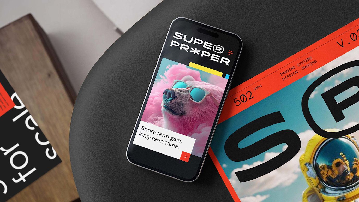
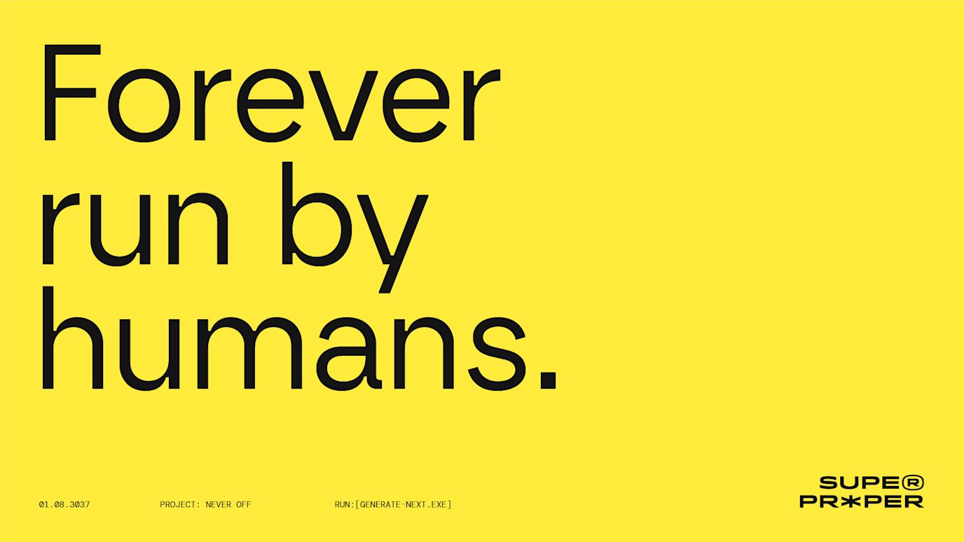

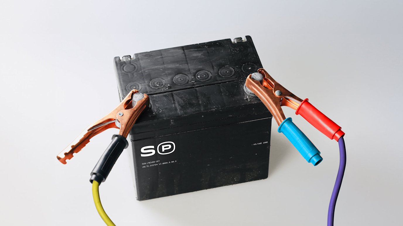


The central idea for this brand identity was to capture the agency’s polymathic nature and it’s ability to intersect tech and creativity. This would inform the primary brand icon - The Synapse - which is a connection point that sparks between the two halves of our brains. The S(P) icon drills down deeper into this space, visualizing a literal toggle between these different brain parts and feeling oh so familiar to what all of SP’s people do one million times a day. On top of that, the whole brandmark system is super responsive, a symptom of being undyingly digital first.
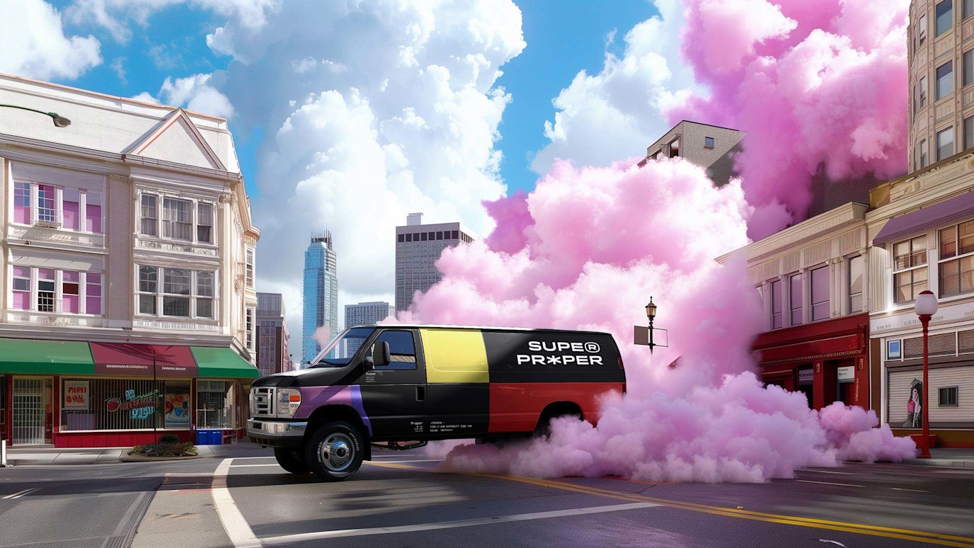
The colour palette and colour blocking are inspired by blocks of data, mimicking LLM tokens and old-school defragging interfaces. The pattern simplifies the icon and multiples it to create its own neural network. And the imagery is a saturated blend of surreal and hyperreal, our own vibrant take on what’s just a touch outside of this reality.
The overall tone is - much like their take on tech and AI - quite colourful and positive and always infused with maximum levels of /imagination. All in all, they choose to generally stay on the bright side of things with the --weird cranked up to 3000, so we wanted the vibe to match.
