Lotly
A new way to buy a home, together
Lotly is a prop-tech start-up that needed a bold brand to match their bold ambition of completely changing the way we buy and invest in real estate, something Toronto (and many other markets) desperately needs. To do that, we developed a dynamic brand inspired by the company’s optimistic outlook and entirely unique offer of providing a new path for people to enter the real estate market.
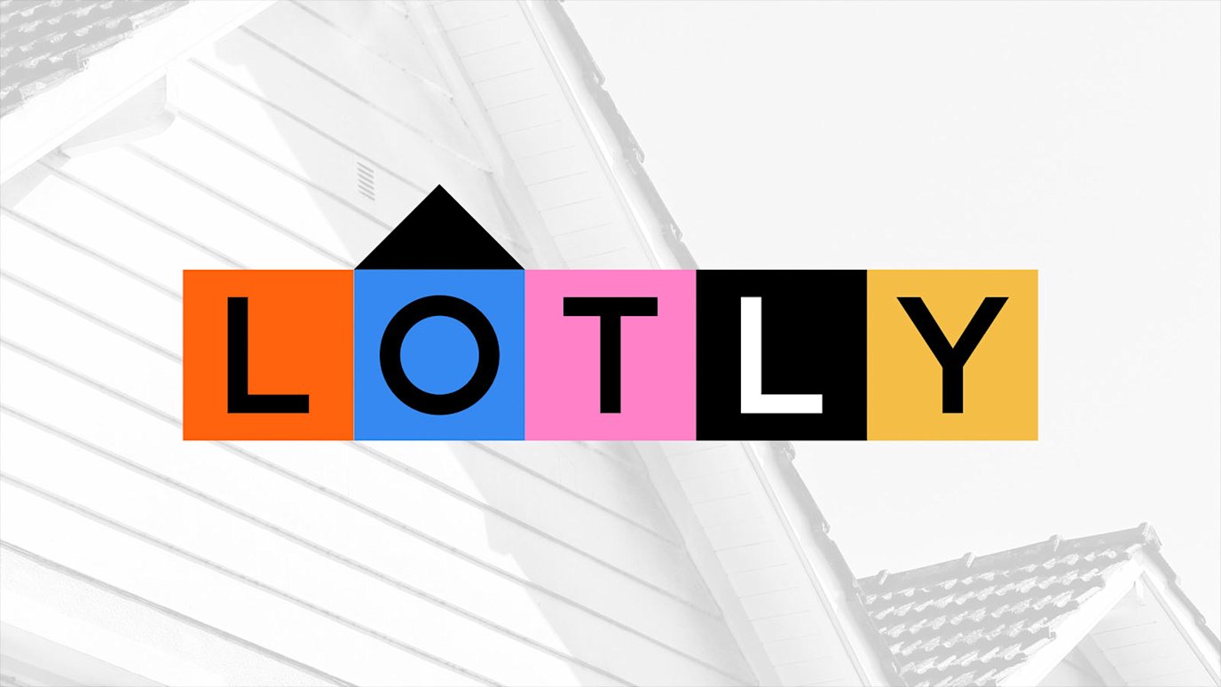
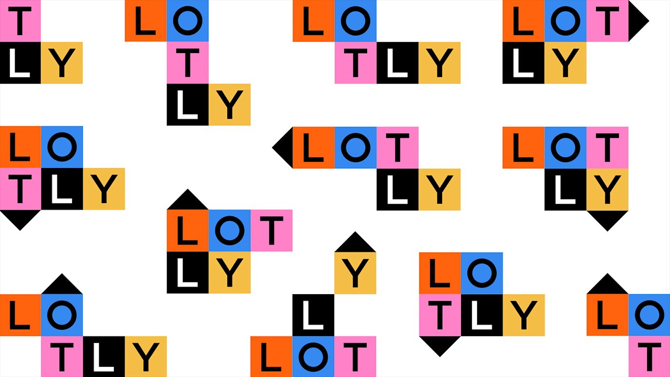
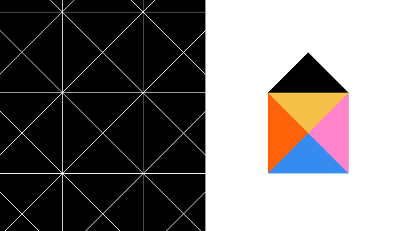


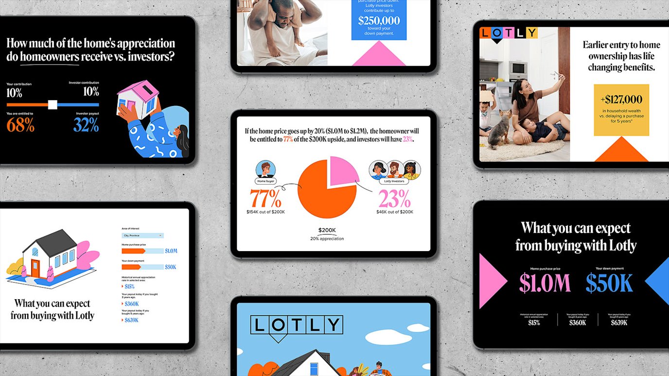
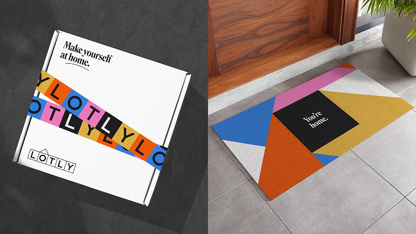
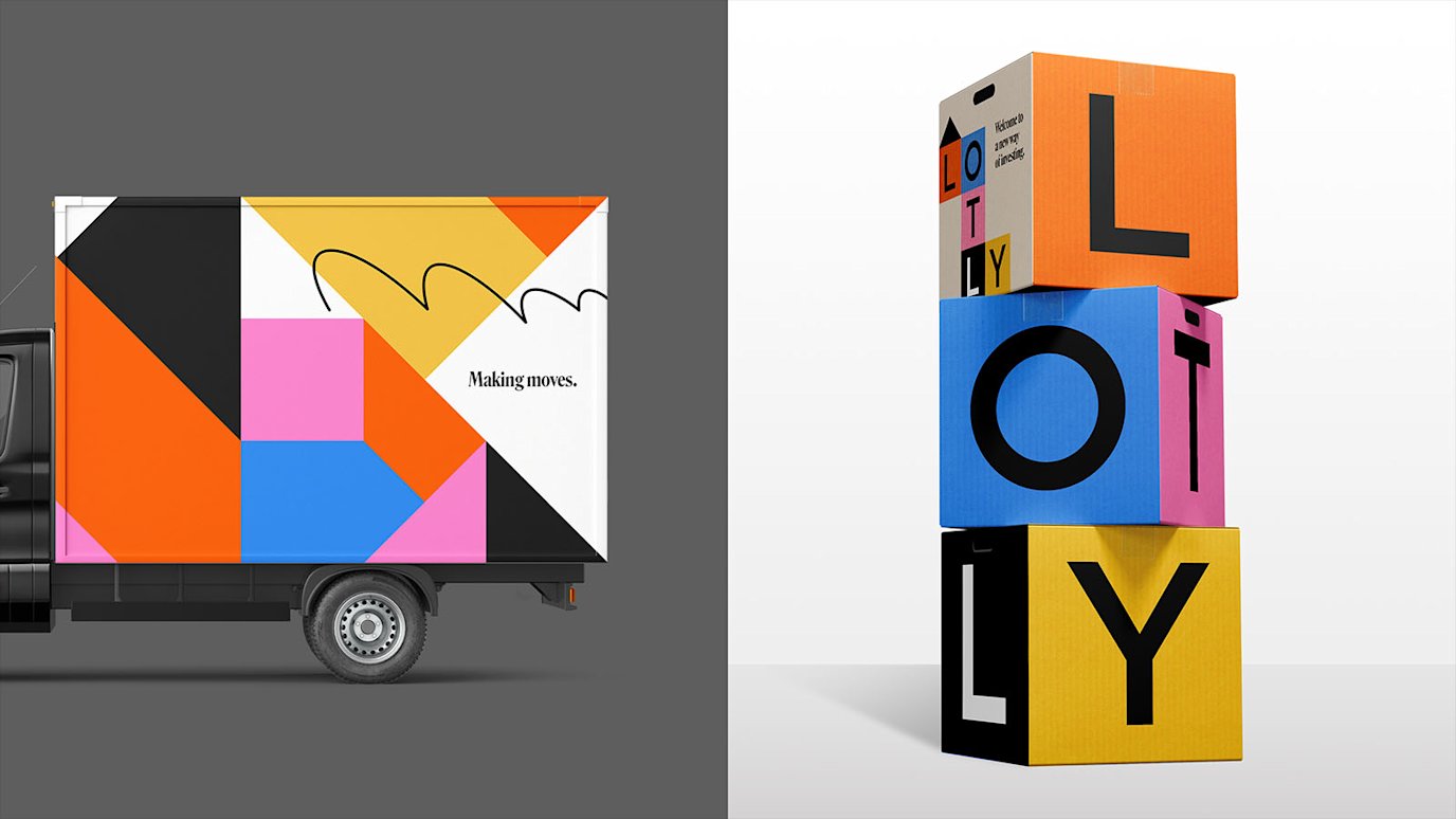
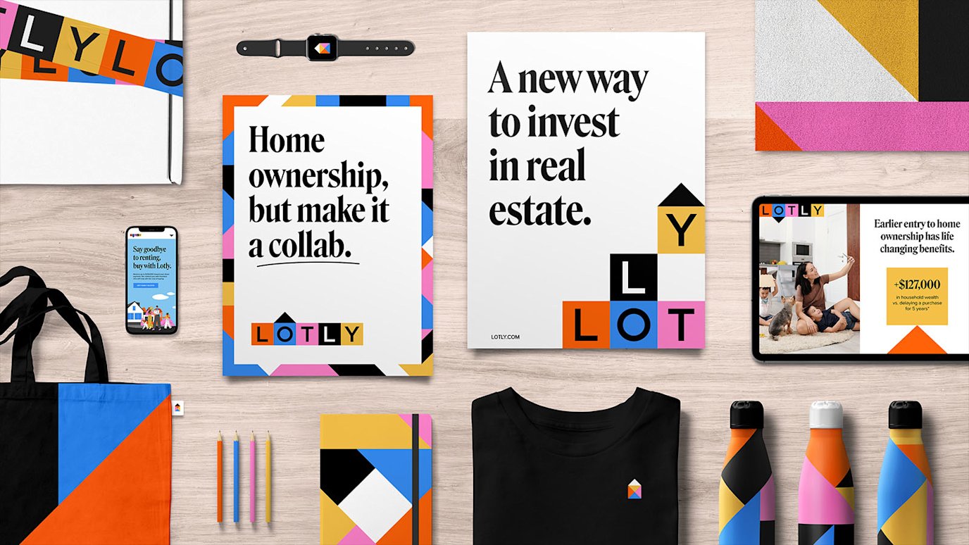
It’s nearly impossible for many people to enter the Toronto real estate market. Lotly set out to change that with a new dynamic model for buying homes, adding optimism and customization and collaboration to a space that needed it. Their brand need to demonstrate all of the above, and stand out in a field of familiar and static brands.
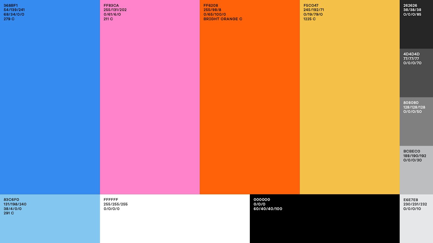
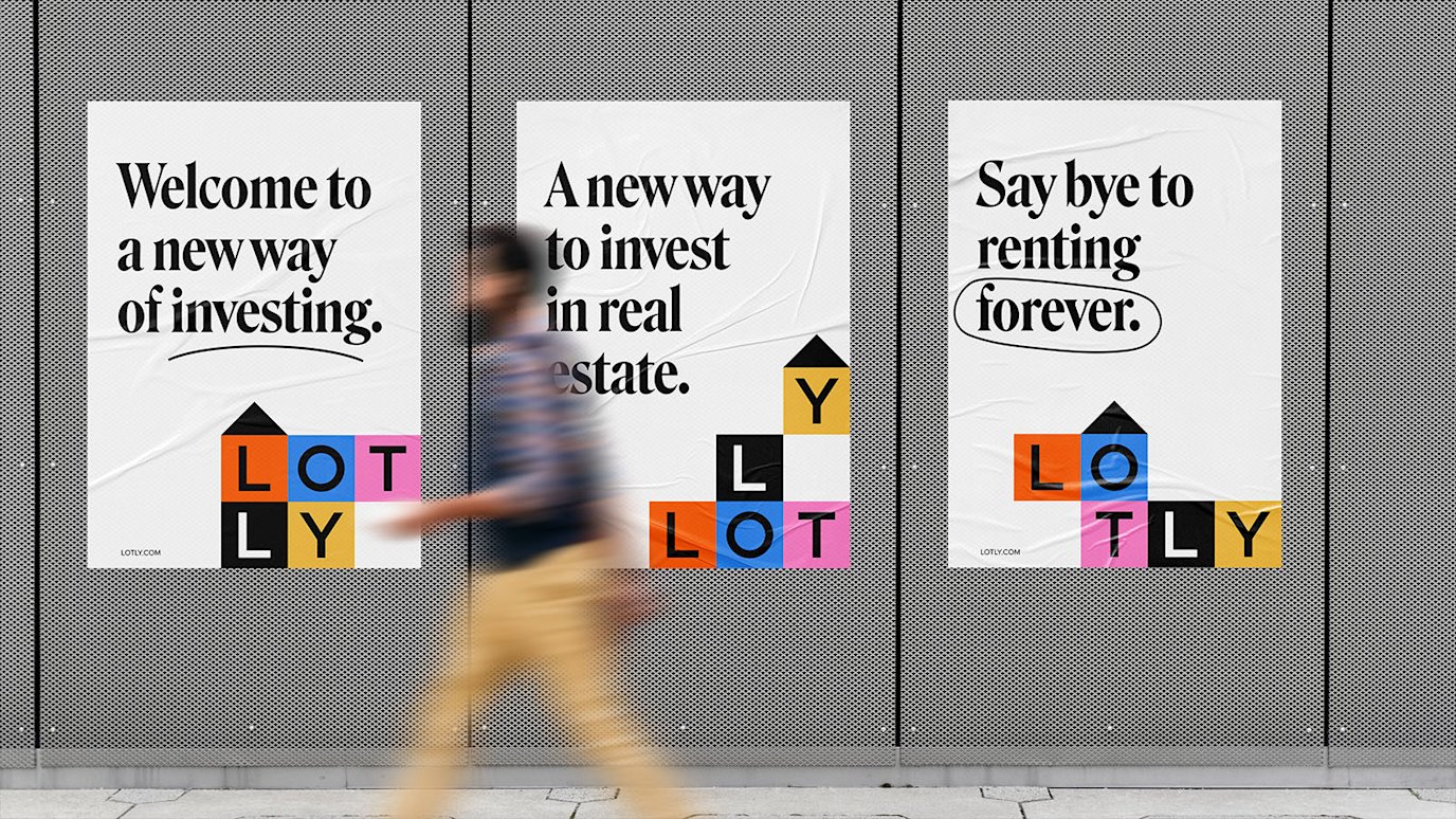
The Lotly brand was built around the vision of changing real estate together. To bring the idea of change and togetherness to life, we designed a dynamic wordmark that was inspired by all the different combinations of home ownership that you could enter into. The colour palette was bright and varied, matching the optimism and options Lotly adds. And the system was anchored by a welcoming illustration style plus a malleable system of lines that symbolized the playful and personal new pathways to home ownership that Lotly provides.

