Scotiabank Global Rebrand
A visual evolution for an iconic brand
The Scotiabank global retail footprint extends across 31 countries. So when the bank was looking to refresh their visual identity to make it more modern, more digital, and more Scotiabank, we knew the solution needed to be multidimensional.
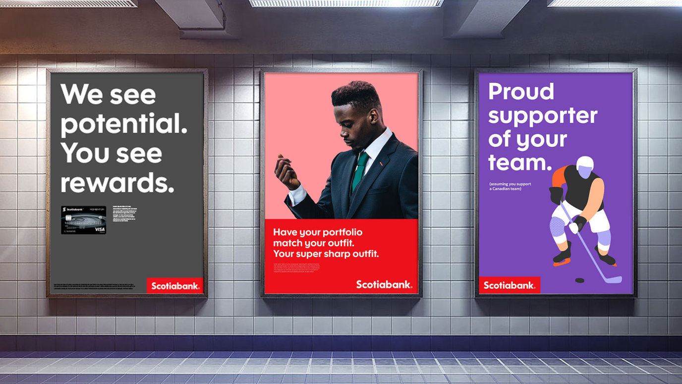
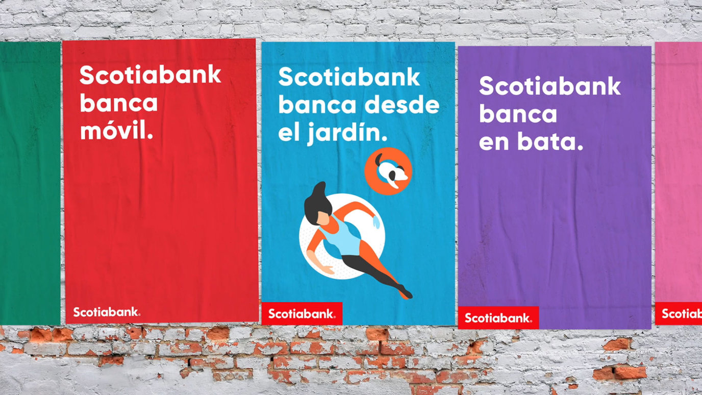
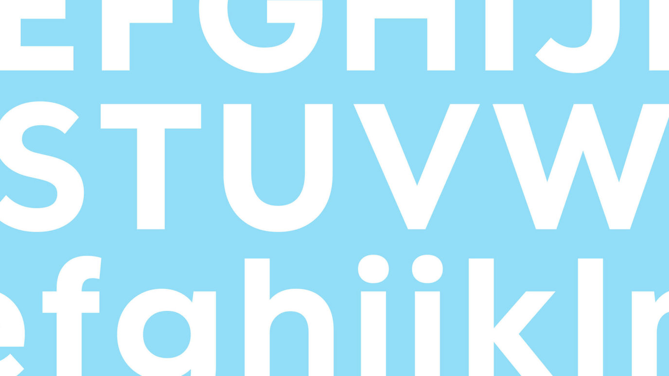
The big idea was to invert the existing Scotiabank brand from the red bank with the colourful type, to the colourful bank that is rooted in red. The end result was more digital, more human, and more like you. Beyond the core idea, we also evolved the iconic brandmarks (the wordmark and the Flying S icon), developed a new custom Scotia font and, oh yeah, helped instigate an ongoing transformation from Scotiabank to Scotia.
Project Stats
Countries
Core colours
Original icons created
