GoodBuds
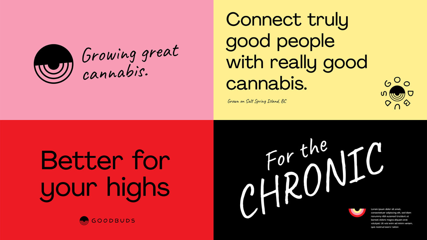
For the chronic
The Good Buds brand design began entirely with the company’s founders and their crystal-clear vision. They wanted to grow really good cannabis (good, meaning stuff that gets you really high) for really good people (good, meaning friendly folk). In other words, Good Buds. Building on that, the two founders tended toward both those ends of the spectrum, with one being super high/stoned all the time and the other being super happy/sunny all the time. Add to all that the fact that Good Buds were the first Canadian growers to receive an outdoor license (sun grown) and the fact that their strains were actually some of the most potent product in Canada, and our concept became clear.
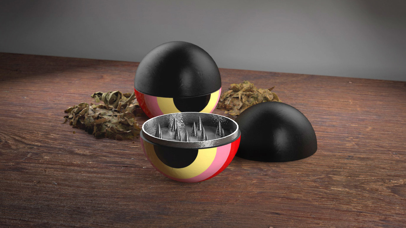
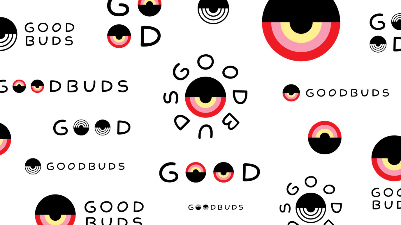
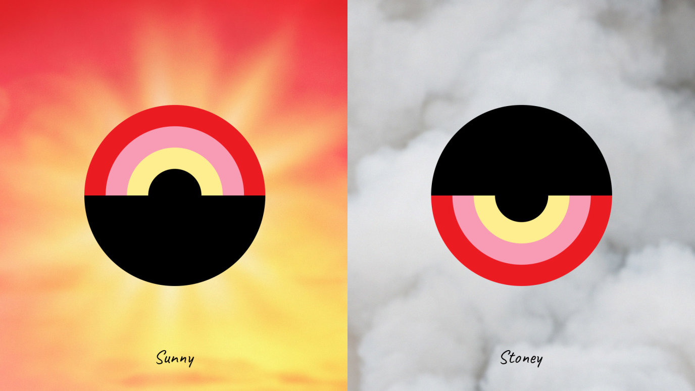
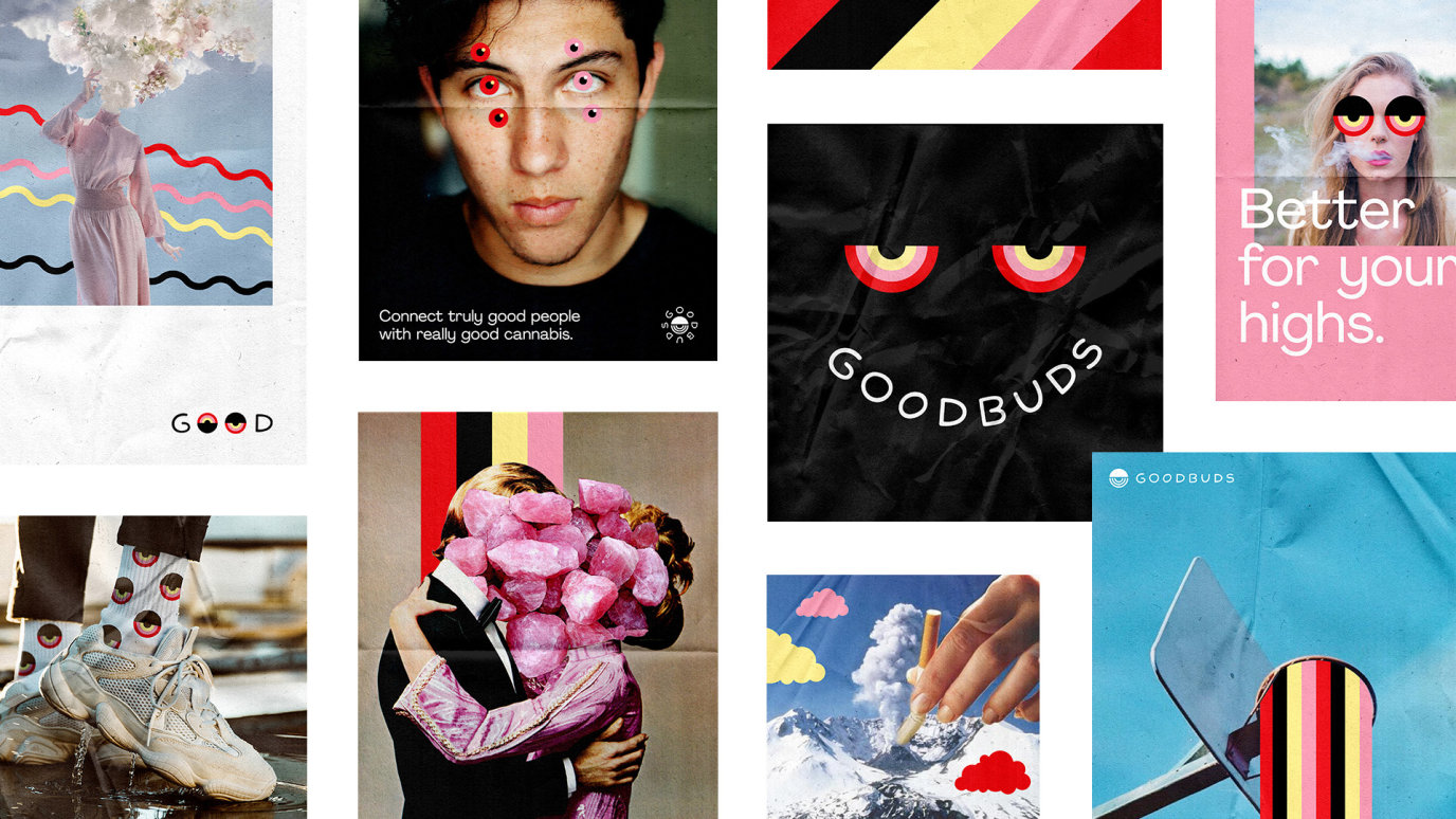
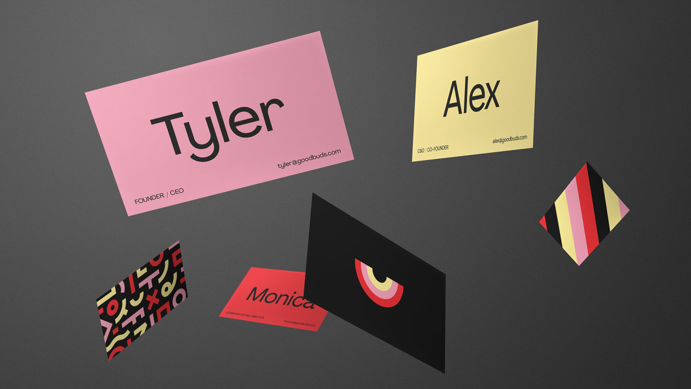
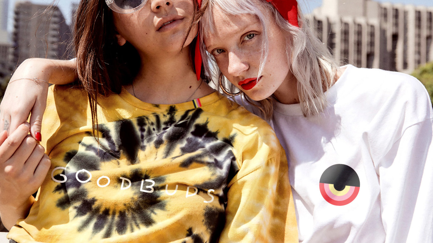
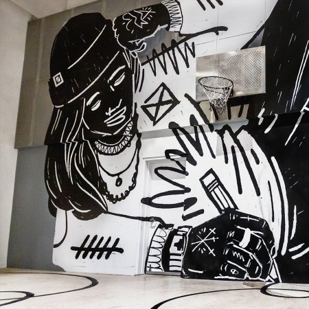
We would anchor the brand in two out there icons, one being Sunny and the other being Stony. These icons would represent all of the above discussed elements and live across all aspects of the brand. We developed a colour scheme drawn from super sweet sunsets (like the ones found on Salt Spring Island, where Good Buds comes from) and super stoned eyes (like the ones found on anyone that enjoys some Good Buds product). These colours and these icons would really stand out from the field, and still do. And, to further dimensionalize the brand and the design system, we developed a brand positioning that was equally unique. Good Buds would stand “for the chronic” meaning both chronic strains of cannabis and chronic individuals. And with that, we extended the design system into the trippy side of things, distorting askew imagery and shifting perceptions, while always maintaining a slice of sunny in the mix.
Project Stats
Brand icons (Sunny & Stoney)
Best Social Media (ADCANN Awards 2020)
Samples shared
